Mens’s Skincare University Logo
Skincare University is a platform about -literally- skin care and all the materials related. The website is originally intended for the female audience, but due to its enormous success, the hosting company decided to release a version for the male audience. The logo for the new branch had to preserve the essentials of the original website, but also had to be unique in its own way. Since care is about protection, and men have forever wield their shields to protect and sruvive, the straightforward idea emerged to be a shield with the initial letters M and C carved into it representing Skincare University's Men's Campus, with somre traits being presrved from the original logo.
You May Also Like
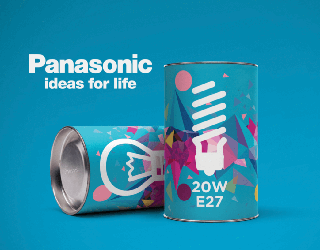
Panasonic Lightbulb Package Design
March, 2015
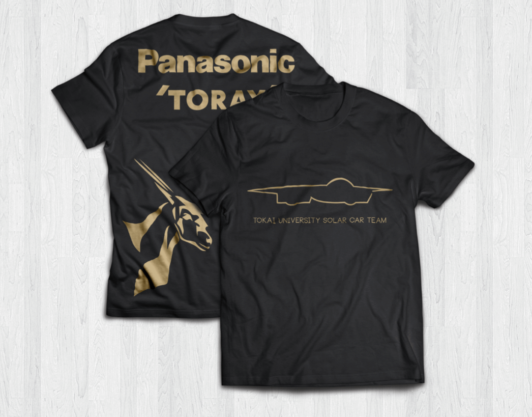
Tokai Solar Car Team Logo
August, 2014
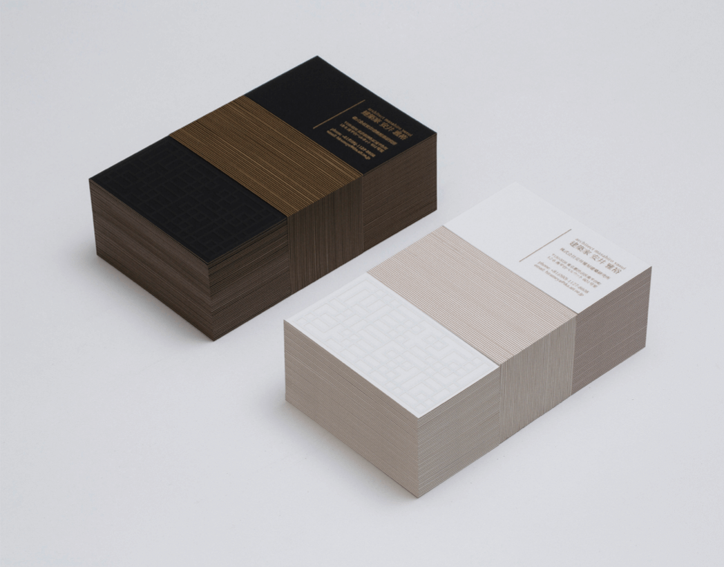
Architect Business Card
March, 2016
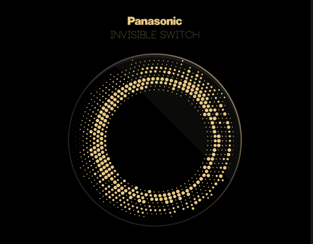
Panasonic Invisible Switch
April, 2015
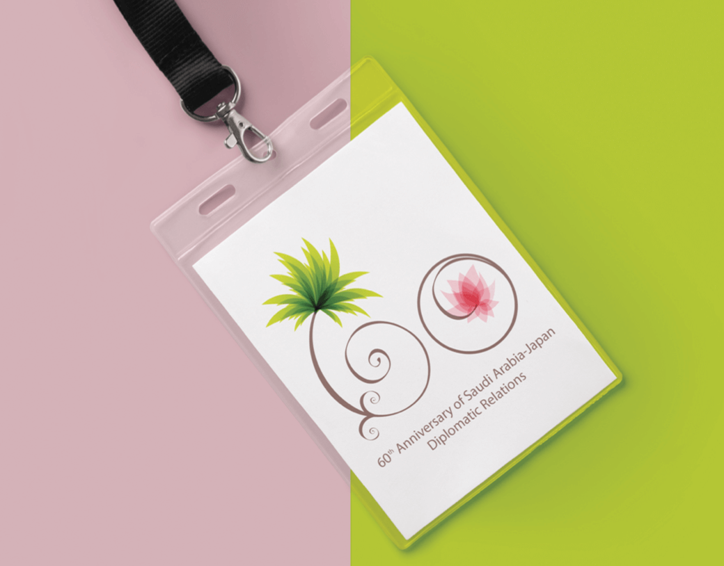
60th Anniversary of Saudi Arabia-Japan
January, 2015

Richmedia Summer Intern Webpage
June, 2013

Piiple
December, 2013

Polygon Art Piece
October, 2013

Club Velocita Branding
December, 2018

Saudi Arabia Ministry of Education Logo
May, 2015