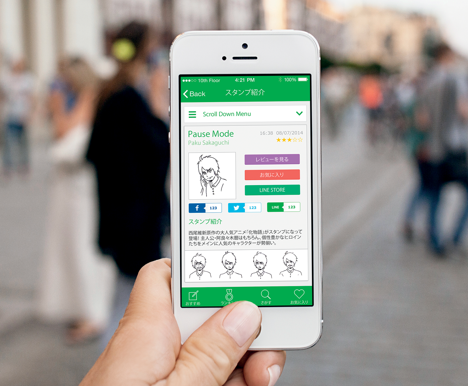
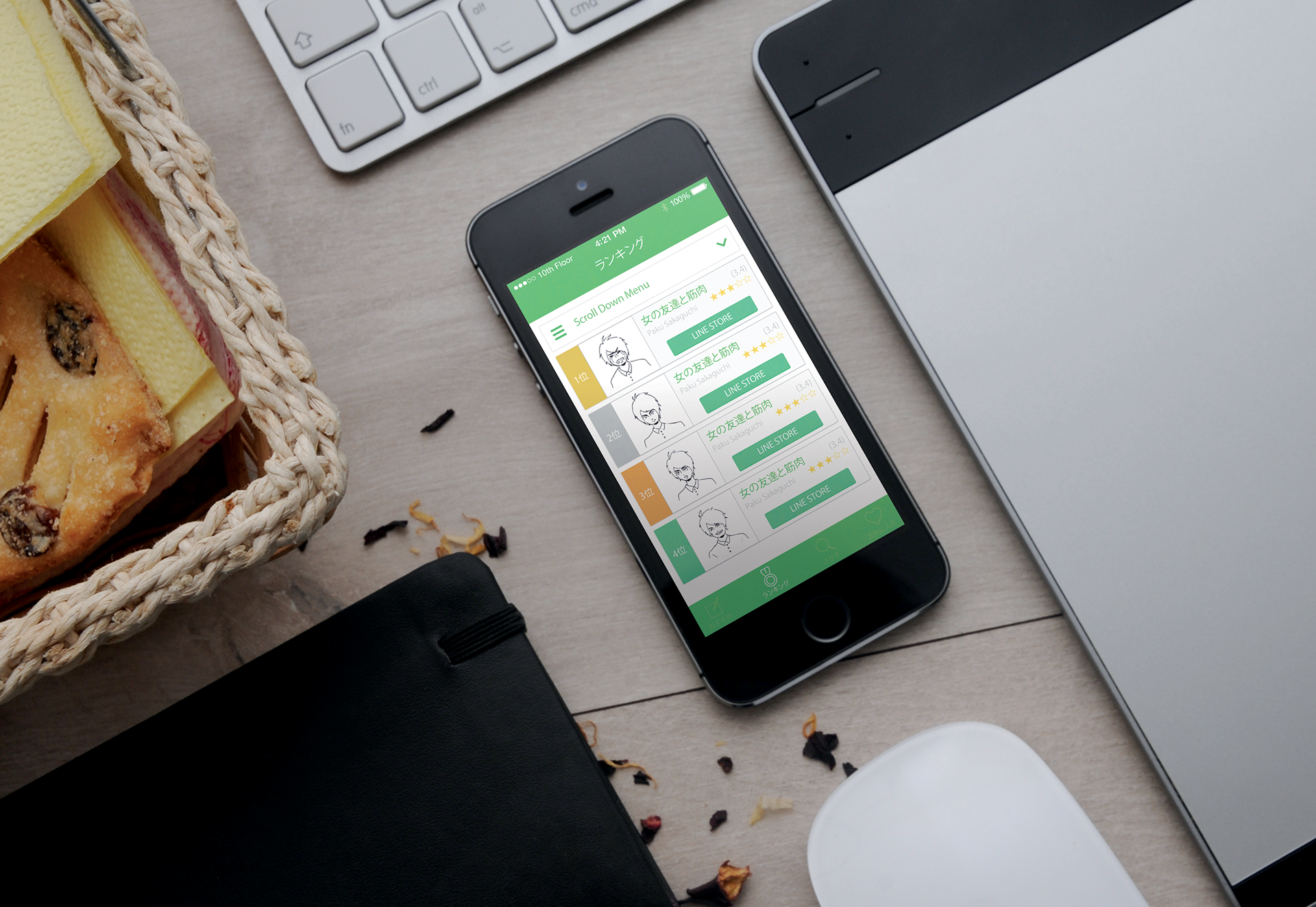
This app is a curation magazine for LINE stamps, produced by Watanuki Kikaku, Ltd. Users can review their favorite stamps, and easily choose which stamps best suits their needs. Our focus was to give a theme consistency throughout the app. We focused on every pixel, making sure it is delivered right to the user’s eye. UX is where we started. Each item’s color, each font’s thickness, where buttons have to go were made so that the user can intuitively move through the app. Next up was UI. We based the theme on flat design, and measured each bar, icon and text to the pixel and made micro adjustment accordingly.