Organic Life Logo
For people who are self-conscious about their health and about living organically, this website provides the latest information regarding just that. To express that in the logo, I chose one of the most basic common shapes in nature, a water drop. The drop shape is also the basis for what a tree leaf looks like, which is why it is used here to stimulate the basis of an organic life: water and plants. It also serves as a reminder of choosing a balanced life by eating healthy and drinking healthy. The gradation in color is to imply the variety of the topics in the website regarding different aspects of living organically and improving lifestyle.
You May Also Like

Polygon Art Piece
October, 2013

Skincare University
April, 2013

Tokai Solar Car Team Logo
August, 2014

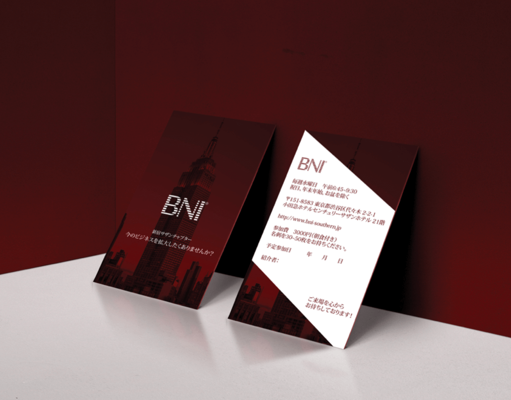
BNI Invitation Card
October, 2015

Darpdecade
July, 2014

Education Fair Flyer
March, 2014

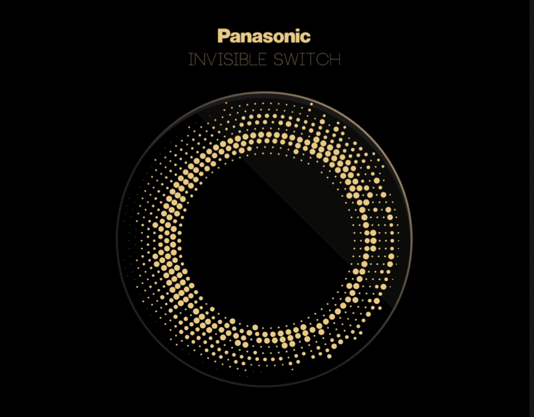
Panasonic Invisible Switch
April, 2015

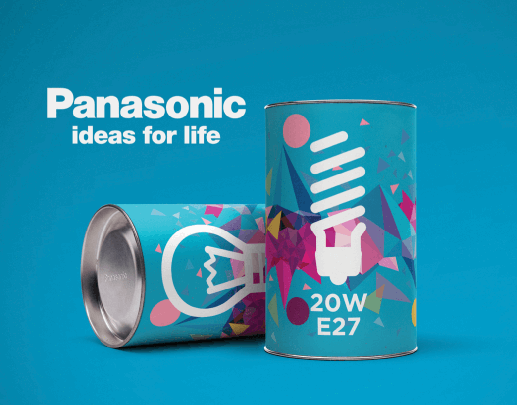
Panasonic Lightbulb Package Design
March, 2015

Dots Service Design
July, 2013

GTR Promotion Video
March, 2016